Showing posts with label mentorship. Show all posts

Sunday, August 24, 2014

[240]

Weekly Word(s): Swift and Stage
I missed a couple weeks due to being at SIGGRAPH and my parents visiting so I found a way to combine both words into the smallest amount of work possible.

Thursday, August 7, 2014

[239]

Weekly Word: Blister
This one was a tough word because I wanted to avoid looking at horrible medical images on google. Instead, I remembered the first time I got a blister from playing on monkey bars and how fascinated and creeped out I was that there was a lump of water under my skin.

Wednesday, July 23, 2014

[238]


 Weekly Word: Branch
This cat is sooo over it.

image
oil 6"x8"

Wednesday, July 16, 2014

[236]

Weekly Word: Camouflauge
I wanted to play with the idea that the spy guy's camouflage makes him all the more conspicuous.

Saturday, July 12, 2014

[235]

Instead of doing digital still lifes, I'm asking Tia to give me one word per week to interpret and paint. It's very much like Daily Spitpaint, but with far less stress. I'd like to get back into the spitpaint scene but at this point, I'm more interested in exploring designs and lighting more than impressing people with how fast I can paint.

Last week's word was PALE.


[234]

Here's my third overcast Ghibli layout painting.

And five daylight paintings done quickly with various hue saturation masking and overlays:


Monday, June 30, 2014

[233]

Tried to paint with mostly big brushes like how I would paint in oil. Perhaps on the next still life I will challenge myself to simplify even more. I'd like to get to the point where I can describe lighting scenarios very simply and directly.

Tuesday, June 24, 2014

[231]

I wanted to paint something with an inherent glow. Like the lightbulb painting, I was also finding it difficult to dial in the exact color + intensity.

Things learned: Glowing objects don't spread their light influence very much. I think it's important to keep everything around the glowy part pretty dark to emphasize the light. The mouse is sitting on my frosted glass desk again. I started painting in a dark line around the mouse and cord thinking it was the shadow, but it was actually the reflection of the object in the glass. The actual shadow was this warmish hue. It was warm because they were exposing the warm wood colors underneath it. 


Monday, June 23, 2014

[230]

It was tricky getting the highlights to feel hot and bright. 

Things learned: the brightest highlight isn't always where the light is hitting. In this case, the bulb is reflecting the light source which is creating that highlight. Also, I was still noticing a little bit of cool bounce light on the bulb even though the surface was in shadow. 


Tuesday, June 17, 2014

[229]

I wanted to practice painting material caked onto a surface. 
Things learned: the shadows are a lot darker than you think they are. In ambient/overcast lighting, it's particularly important to reserve the whitest whites for highlights. Everything else should start much more subdued. Even the whites I used here aren't white white. The paper underneath looked bright and glowy, but when I painted that, it was popping out way to much. Subduing it helps make the paint globs stand out. 

View from farther away :)

Tuesday, June 10, 2014

[227]

Another surface study.

Things learned: There are so many colors/objects that were getting reflected in the chromy part, but when I tried to paint everything I saw, it got really messy and busy. I picked fewer, major shapes and edited the rest. I think it turned out more successful that way.

Monday, June 9, 2014

[226]

I decided to do a still life exercise focusing on different material properties since that is the challenge for my next Ghibli assignment. I suppose it's been a challenge for all of the assignments, but I'm going to try to be more diligent about it this time.

Things learned: I was noticing in this what Bill Cone had mentioned in class of blues becoming more saturated when reflecting bluish light and other colors becoming more desaturated, particularly in the paints on the knife. Also, tinting the brightest part of the barcode sticker slightly blue really helps sell overcast lighting.

[225]

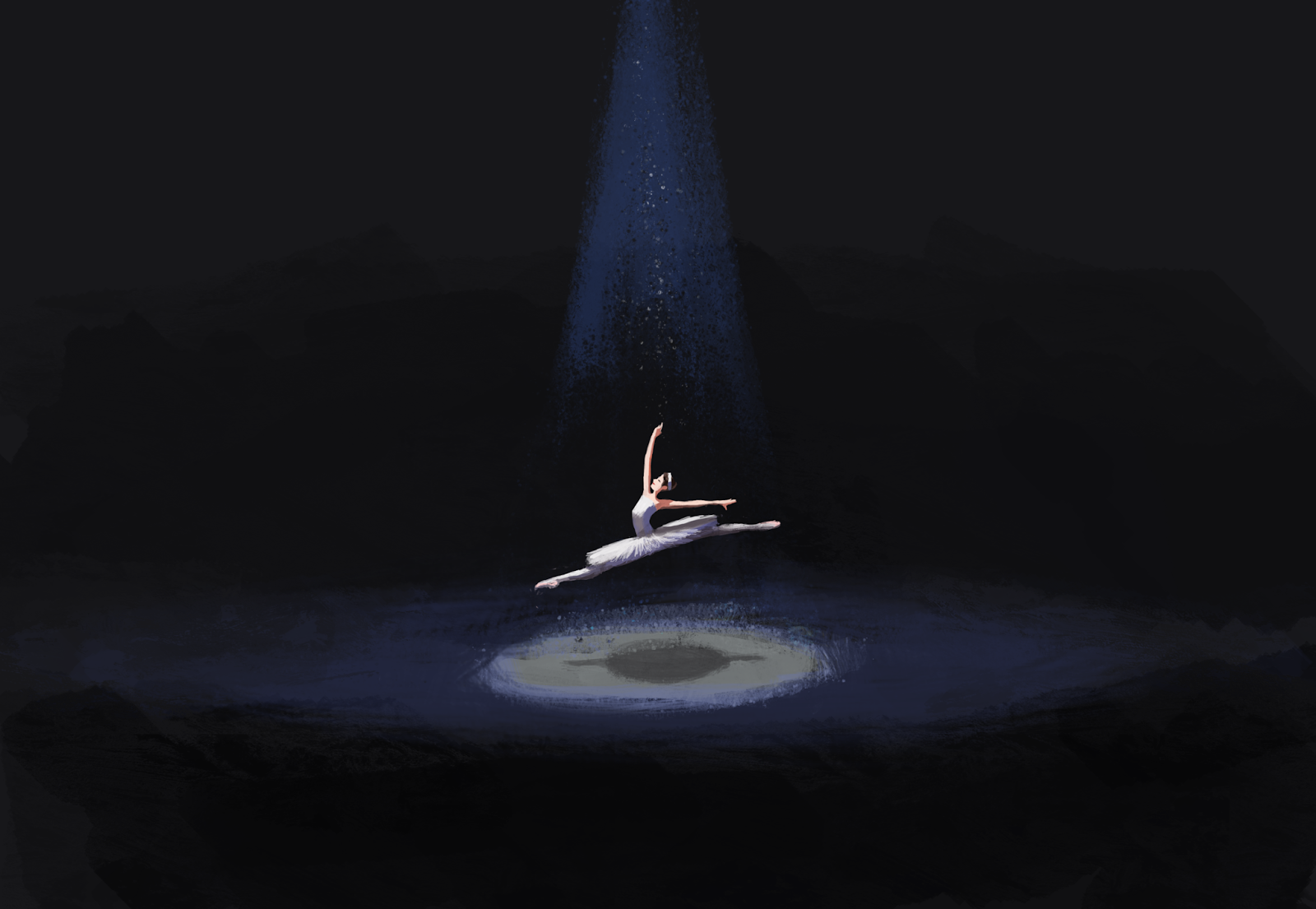
I finished up my second Ghibli painting. It was an interesting challenge trying to get it to look like one unified painting rather than two paintings-one in the foreground and one in the background. I'm posting both versions of my painting. I still like the colors on the foreground pots in the first painting, but I really wanted the blue light to be the focal point so I had to readjust all of that in the second. 

First rendition where I intended for the blue background light to be the focus, but got caught up with making the foreground look glowy. 

Second rendition where I darkened the foreground a lot, but still wanted to keep some hint that there was an overhead light. It gets a bit murky, but I think it does make your eye go to the background barrels first now.

Tuesday, May 27, 2014

[219]

The colors started to get a little muddy. I think I could have also simplified the bottom of the glass quite a bit.

Things learned: Occlusion shadows under an object are not necessarily just outlining the bottom of the object, nor are they necessarily only on one side of an object. In this painting, the light is behind the object. Since it's so translucent, the darkest shadow patches are on the sides of the object

digital

Sunday, May 25, 2014

[217]

This is a lighting and color study I've been working on. It's a layout from Studio Ghibli's Princess Mononoke. I used various photo references for painting this, but I didn't look at the movie for reference at all.

Wednesday, May 14, 2014

[216]

Painted the box under ambient/morning lighting today. 

Things learned: It's important to get some patch of the darkest color down. I started by painting the box and thought that I was matching colors pretty closely. They looked pretty good relative to each other, but once I put down the shadow I realized I needed to darken everything. I also found it interesting that the darkest side of the box was significantly warmer than the rest.
digital

Monday, May 12, 2014

[215]

I've been spending about an hour on all these digital paintings recently. For this box, I was planning on doing a lighting study of ambient lighting and spot lighting, but it took me about 20 minutes just to get the perspective to look right and even still, the box I painted is taller than what it should be! 

Things learned: Establishing major colors on each of the box planes gets you most of the way there when lighting boxes. Capturing the warm colors right at the edge of shadows makes it look way more awesome!!

digital

Saturday, May 10, 2014

[214]

I wanted to paint different metallic surfaces. 

Things learned: Copper tends to turn purplish green and silver reflects a lot of ambient yellows
digital

Wednesday, May 7, 2014

[212]

I'm going to start writing things I've learned while painting the things I post. That should be more useful than writing nothing at all.

Thing learned: Dark colors can get really bright and light colors can get really dark. Also warm and cool darks can exist within close range on the same object.

digital

[211]

The perspective was tricky on this. It still looks funky to me.
digital